The text choice answer format allows the participant to choose from a set of options.
Text Choice and Value Picker are similar. Text Choice is good when you only have a few options, or want to allow multiple choices. Value Picker is good when you have a lot of options, since it only shows a few at a time.
Styling options for Buttons and bubbles (detailed below) allow for visually distinct participant experience.
Basic Properties
The answer format has several basic properties:
| PROPERTY | FUNCTION | EXAMPLES |
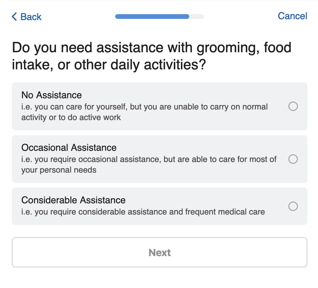
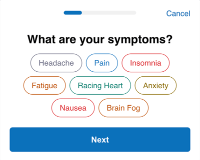
| Text Choice Style |
Whether the participant can select one choice or multiple choices, and whether choices should be displayed as buttons or bubbles. |
Single Choice Multiple Choice |
| Default Value | A default value that is already selected for the participant.
|
0 |
| Text Choice Description Style |
Whether the description of each choice is always displayed, or only displayed when the participant expands it. Note: Descriptions will not display using the 'Single Choice (Button)' Text Choice Style. |
Display Always Display When Expanded |
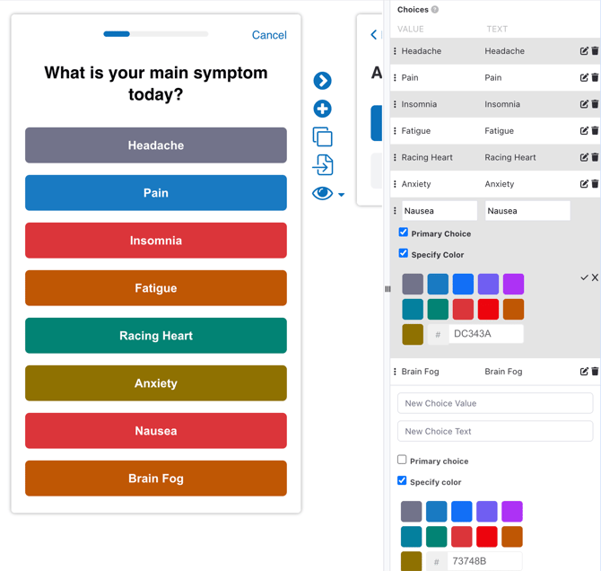
| Text Choices | The choices available to the user. | See Text Choice Properties.
|
Text Choice Properties
You must also configure one or more choices. Each choice has the following properties:
| PROPERTY | FUNCTION | EXAMPLES |
| Value | The value of the choice which is not displayed to the participant. This is what will be saved as the answer when the participant submits their response. | Always, Never, 0, 1 |
| Text | The text of the choice which is displayed to the participant. | All the time, Never |
| Description | A longer description of the text choice. You can configure whether this description is always shown or only shown on demand with the "Text Choice Description Style" option. | Select this if... |
| Exclusive (other choices deselected) | For Multiple Choice styles, whether selecting this choice excludes selecting any other option and will deselect others if chosen. | |
| Primary Choice | For "Single Choice (Button)" style, whether this choice should be emphasized visually compared to the other choices. If at least one choice is selected as a Primary Choice, all choices which are not Primary have their color inverted. | |
| Specify Color | Define the color of the button or bubble. Choose from predefined colors or enter any hex color code value. By default, buttons and bubbles use the color of the 'Next' button. | #187AC1 |