Reducing Participant Cognitive Burden
When creating a survey with MyDataHelps Designer, it's crucial to minimize the cognitive load for participants. By reducing the mental effort required to complete a survey, you can improve the participant experience, which reduces drop-offs and increases response accuracy. This article covers best practices for reducing cognitive load in three areas: survey content, style and format, and mechanics. Implementing these practices will lead to more efficient, participant-friendly surveys that deliver better results.
Survey Content
When participants have multiple surveys and questionnaires on their devices, long blocks of text, and unclear information, it can be overwhelming and confusing. To reduce this cognitive burden, create surveys with clear, concise, and digestible content. Here are some best practices to improve the participant experience.
Best Practice 1: Providing Context and Instructions for the Survey
Participants can feel overwhelmed if they don't know what to expect from a survey. Using the first step of the survey to provide context and general instructions can help ease their cognitive burden.
Consider including the following in your survey's introductory step:
- Purpose and Context: Explain why participants are being asked to complete the survey, providing them with a broader understanding of the study's goals.
- "This survey is designed to..."
- "This is an enrollment survey for a cohort and voluntary study."
- Instructions: Give clear, concise guidance on what participants need to do to complete the survey and contribute to the study.
- "Only consider how you felt over the past 24 hours."
- Notes and Disclaimers: Include any important disclaimers or information about study duration, privacy, participation, and survey-specific rewards and benefits.
- "You can leave the study whenever you want."
- "You will earn rewards for completing this survey."
- Estimated Completion Time: Inform participants how long the survey will take so that they know whether they can complete it now or need to return later.
- "This survey will take about 10 minutes to complete."
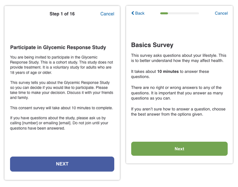
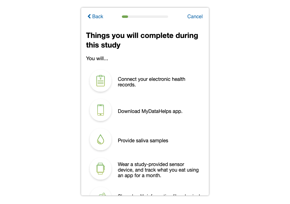
Additionally, you can use formatting and styling techniques to make the introductory information more digestible. For example, consider using an FAQ format or bullet points to organize the content clearly and make it easier for participants to absorb key information.
Best Practice 2: Using Participant-Friendly and Relevant Language
As a survey designer, you might be accustomed to using scientific and medical terminology when creating surveys and analyzing data. However, surveys filled with jargon or technical language may confuse and alienate participants, making it harder for them to complete the survey. Keep the language at approximately a 6-8th-grade reading level (or lower for pediatric participants), given that the average reading level for U.S. adults is at the 8th-grade level. Avoid unnecessary scientific jargon to ensure a smooth participant experience.
For example, the term "PHQ-9," or "Patient Health Questionnaire-9," might be understood by survey designers as a tool for assessing depression severity. However, for participants, this term may not mean anything. Instead of referring to the survey as "PHQ-9," you could call it a "Mood and Affect Questionnaire," which is easier for participants to understand.
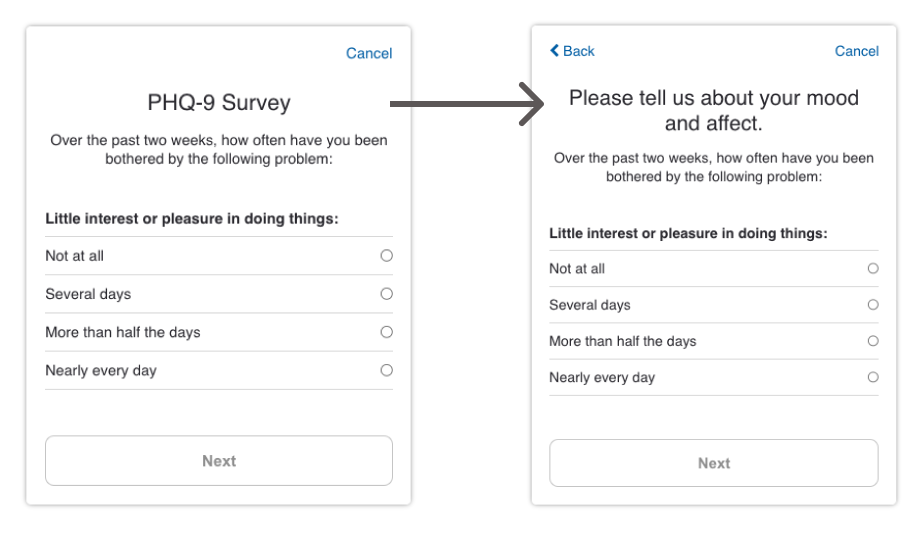
If you need to reference medical terms or conditions that might be unfamiliar to participants, consider using everyday language to explain them. This approach helps participants feel more at ease and reduces the likelihood of misinterpretation. For instance, instead of using complex medical terminology to describe symptoms, opt for simple, commonly understood words to convey your message effectively.
Survey Mechanics
Beyond focusing on the content of a survey, you can also reduce cognitive load by optimizing the mechanics and configuration of the survey. A key aspect is ensuring that participants don't feel like they are stuck in a survey with no end in sight, which could lead to disengagement. You want to make participants feel like they are moving forward with the survey progress. Here are some best practices to keep in mind.
Best Practice 1: Use a Progress Bar to Indicate Participant Progress
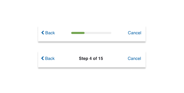
A progress bar at the top of the survey helps participants feel like they are making steady progress. It visually indicates how far they've come and how much further they need to go, reducing the feeling of being trapped in a never-ending survey. This simple visual cue can significantly enhance participant engagement and encourage them to complete the survey.
Best Practice 2: Prioritize Horizontal Progression Over Vertical Scrolling
When participants use mobile devices to fill out surveys, vertical scrolling can be tiring and lead to survey fatigue. To minimize this, prioritize horizontal progression by breaking down questions into smaller steps rather than stacking multiple questions in a single vertical layout. With MyDataHelps Designer, you can use single text choice steps instead of listing multiple text choice questions within a single step to reduce vertical scrolling. While this may result in more individual steps, the horizontal progression feels less burdensome and reduces participant fatigue.
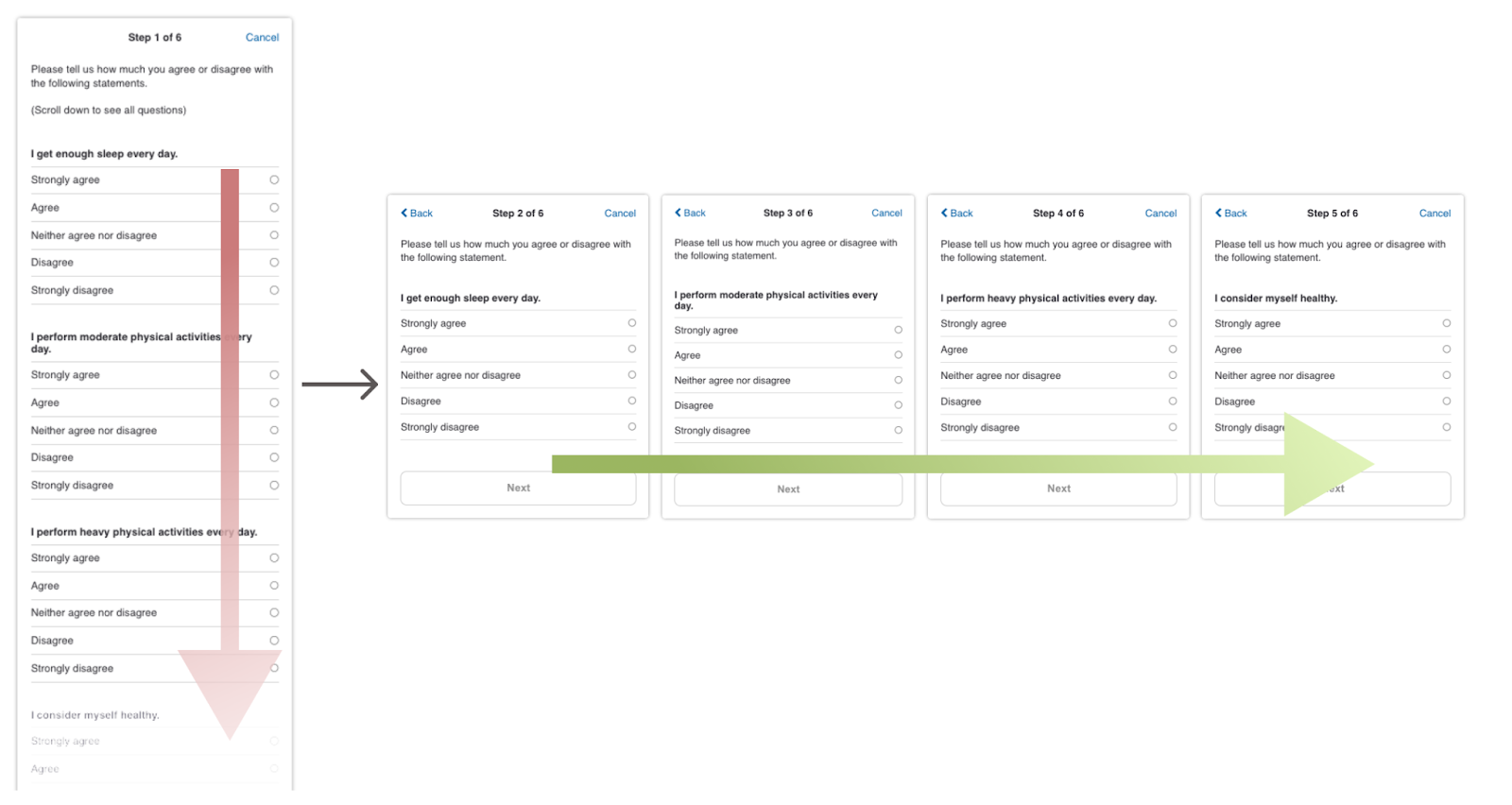
The survey step on the left adds multiple form items within the same step, making it difficult to scroll through. Break them into multiple steps like the survey step on the right so that the participant can feel the forward movement by clicking “Next” instead of scrolling through the step. Form steps should be reserved for short and highly-related questions, such as basic demographics.
Implementing these survey mechanics can help you create a smoother experience for participants, keeping them engaged and motivated to complete the survey. This, in turn, can lead to more accurate and complete survey data as well.
Survey Style and Format
Another way to reduce cognitive load for participants is by using style and formatting to make important information and keywords stand out. When surveys contain large blocks of text, participants can become overwhelmed by information overload or lose track of what the questions and options are. Effective styling and formatting can help break up text and highlight key information, making the survey easier to navigate.
Best Practice 1: Use Bold and Italics to Emphasize Key Parts of Survey Questions
Surveys often contain multiple questions or options with similar wording, where the context or conditions vary slightly. This can make it challenging for participants to identify key differences. To alleviate cognitive burden, use bold text to emphasize crucial keywords or phrases. Here are some examples:
- If a group of questions has a similar structure but with varying scenarios, bold the keywords that change between them.
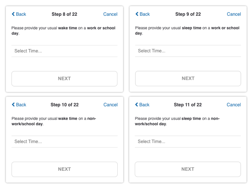
Without the bolded keywords, it may be difficult to identify how these questions are asking about different scenarios.
- When a question contains negations, like "not," bolding these words can help ensure they are not overlooked.
- When listing examples within a question, italicize the examples to reduce the cognitive load of reading through text.
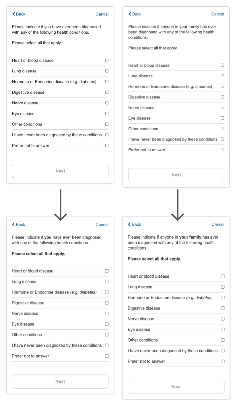
In this example, the keywords “you” and “your family” are bolded to emphasize the changes and differences to be identified across the survey. In addition, examples “(e.g. diabetes)” are italicized to make them stand out.
Best Practice 2: Use White Space and Positioning to Improve Readability
Making effective use of the real estate on each survey step can make information clearer. Generally, the top of the screen with larger font sizes is prime real estate on the survey screen. You can use white space and line spacing to break up text and improve readability as well. Here are some ways you could utilize this best practice in your survey:
- When multiple questions share a common scenario or condition, group the repetitive information at the beginning of the step.
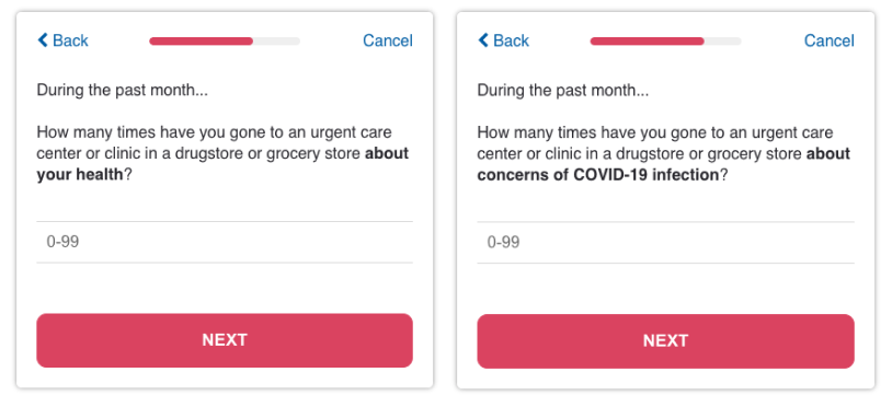
- If a set of questions has a common instruction or element, use line breaks to separate out the changing parts, reducing confusion.
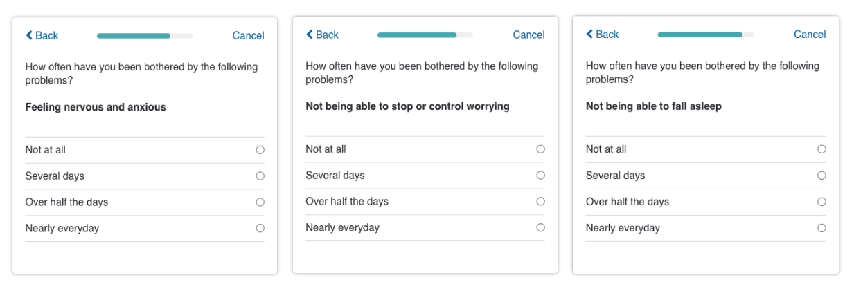
- Avoid wasting the title space with redundant or irrelevant information. Ensure each step has a unique and descriptive title to guide participants through the survey.
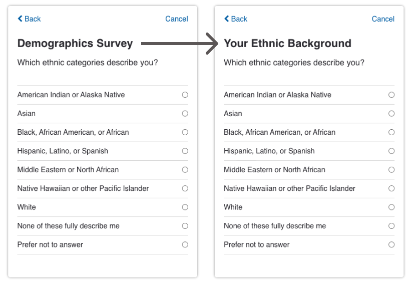
In this example, the title “Demographics Survey” is not necessary, as the title of the survey should be already given to the participants. Instead, choose a title of the step that informs the participants about the specific content of this survey step (e.g., “Your Ethnic Background”).