A key element in designing a survey that offers participants an engaging experience is the look and feel. Consistency in design elements and the strategic use of visuals can create a professional and cohesive experience. This article explores best practices for achieving a polished survey appearance through two key areas: consistency of design and the use of visual elements.
Consistency
A professional and consistent design keeps participants engaged and ensures they recognize the survey as part of a cohesive study. Maintaining consistency in design helps to eliminate confusion and enhances the perception of professionalism.
Best Practice 1: Use a Consistent Font Family and Font Size
A consistent font family and size across the survey contribute to a clean, professional appearance. Although font size can be adjusted to emphasize specific information, using too many different fonts or sizes creates a sense of disorder and can confuse participants.
To maintain consistency, use the same font size for titles, body text, and survey options. Only deviate from this rule when necessary to highlight specific keywords or sections. For font families, choose a uniform style throughout the survey.
When building a survey on MyDataHelps Designer, if you mix Web View steps with standard steps, ensure the font family in Web View steps matches the rest of the survey.
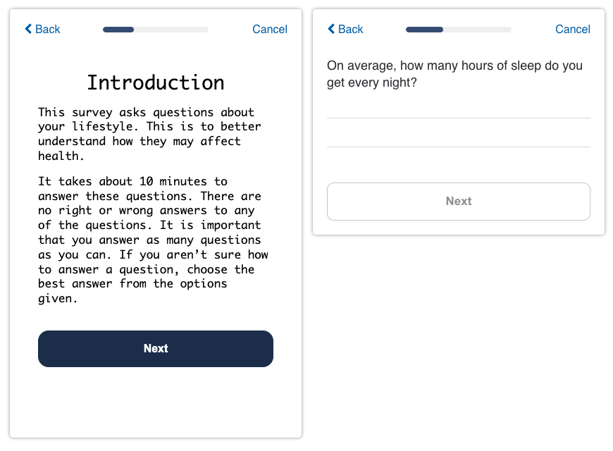
This example illustrates an inconsistency in font families between the two steps in the same survey. Such inconsistencies should be avoided for a cohesive and professional survey design.
Best Practice 2: Use a Consistent Color Scheme
Similar to font consistency, a uniform color scheme throughout the survey enhances the visual coherence and supports your brand's identity. Consistent use of color contributes to a professional feel and helps participants recognize the survey as part of a larger study or organization that is running the project.
While it's acceptable to use a variety of colors, ensure they align with your brand's color palette. Strategic places to incorporate color include buttons, text, progress bars, icons, and illustrations.
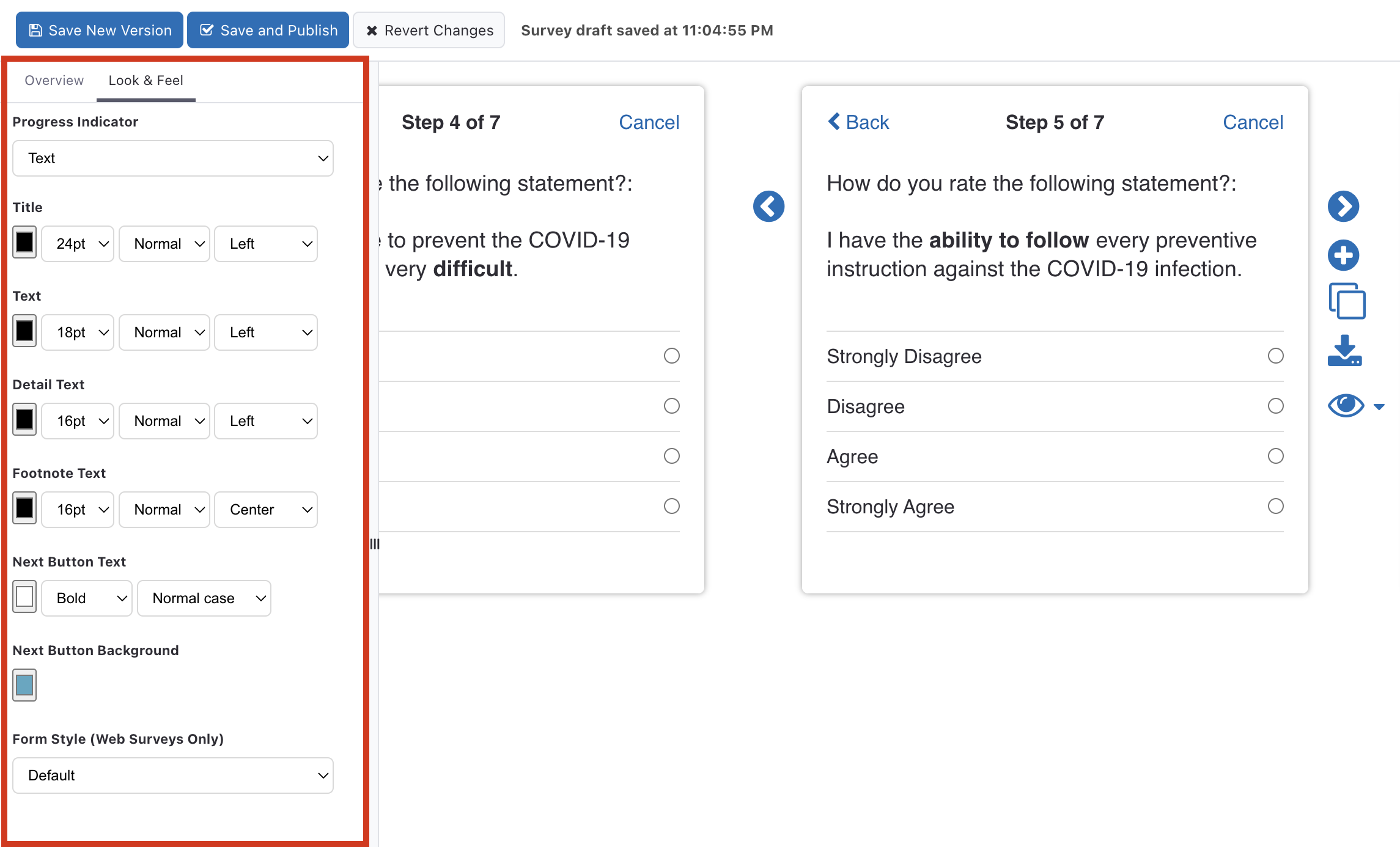
In the Survey Editor, you can select colors for buttons, text, progress bars, and more. Use the Web View step to configure more advanced color schemes using CSS.
Remember to maintain a consistent look and feel across all your surveys, not just the initial ones you create.
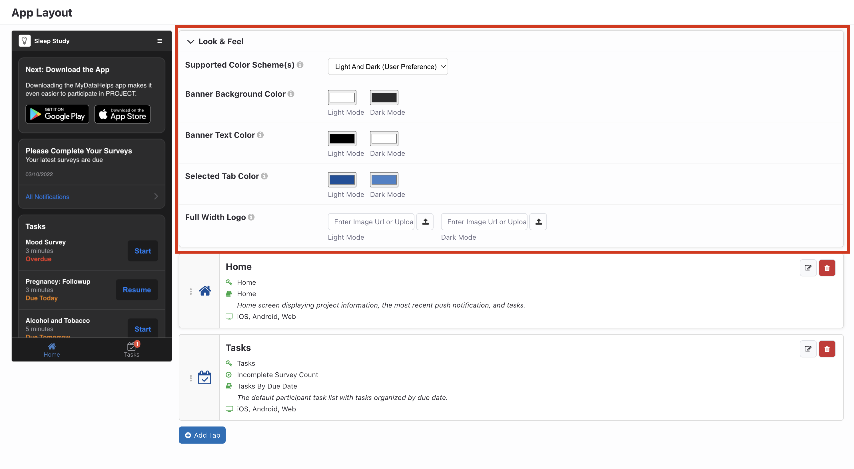
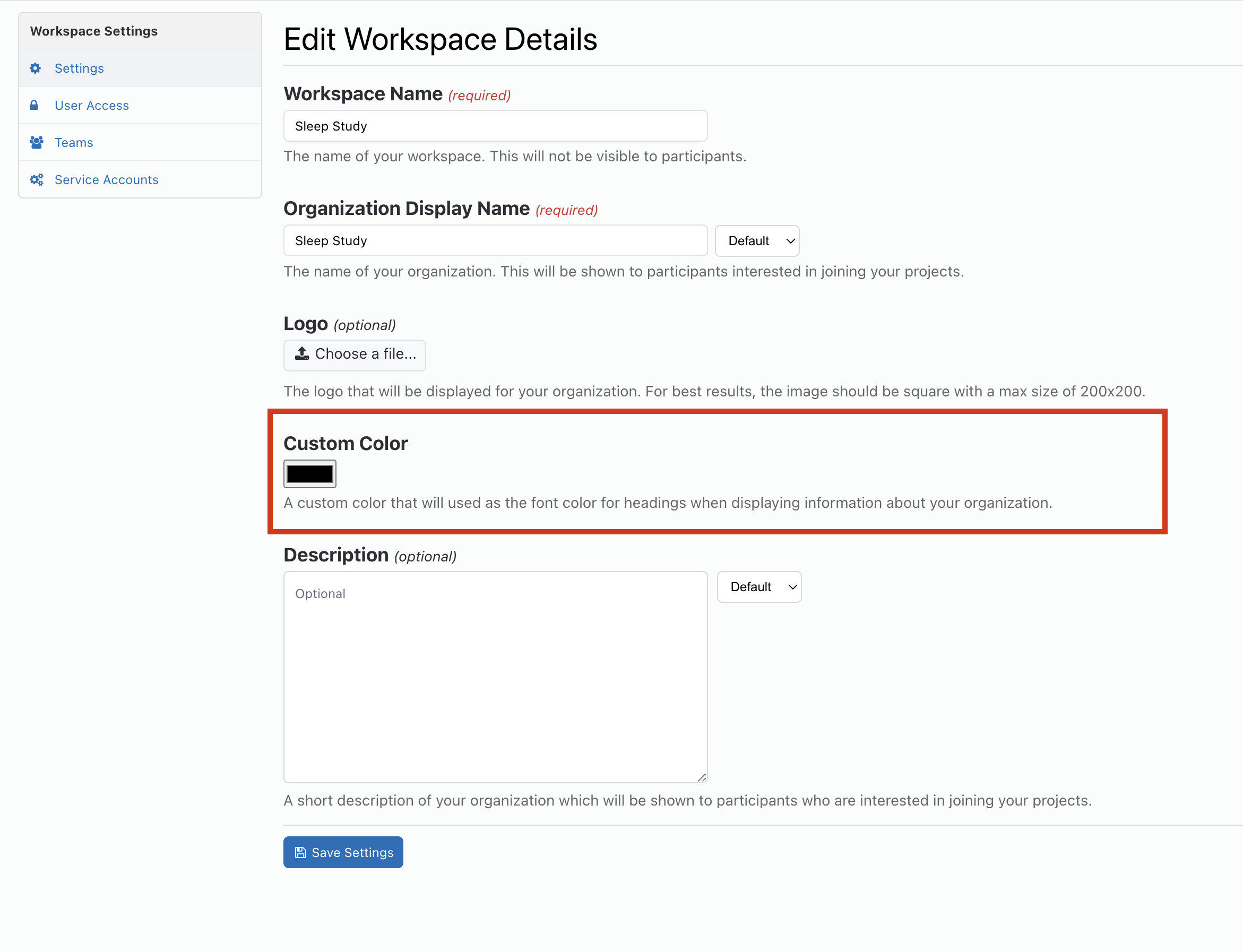
Consider maintaining a consistent color scheme not only within the surveys but also across the App Layout which customizes colors for app components visible to participants and within the Workspace Settings where custom colors can be applied to the font color for headings when displaying information about your organization.
By adhering to these best practices, you can create a visually appealing survey that maintains the professional look and feel and consistent branding.
Visual Elements
Best Practice: Use Icons and Illustrations Where Appropriate
Visual elements can significantly enhance engagement by providing context and making instructions more intuitive. Including icons and illustrations at strategic points in the survey can hold participants' attention and guide them through the survey with less cognitive effort.
A great starting point is to use sample Web View steps: you can import the sample step and modify and extend it for your own use, or copy/paste the code from the step editor into your own step to display icons and illustrations.
However, remember that these samples are generic and may not align with your survey's themes or branding. To maintain a consistent look, you'll need to adjust these samples to match your survey's style and tone. If you're comfortable with HTML/CSS, you can add your own custom graphics to the Web View step. Although the customization of design may require additional effort, it can have a significant impact on the overall experience for your participants. This approach ensures that your survey maintains consistent branding, creating a smoother and more cohesive experience for your participants.
Here are some ways to effectively use these visual aids:
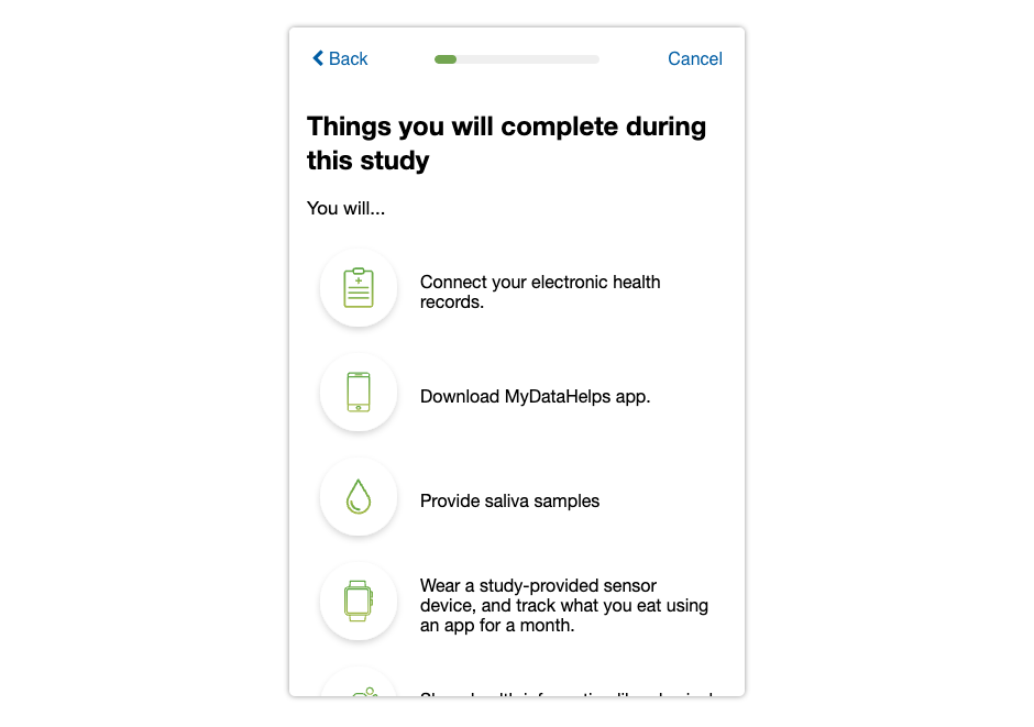
- Introduction Step: Include icons alongside bullet points to highlight disclaimers, benefits, and important instructions for the survey and study. To source icons, consider using resources like Icons8 and Heroicons to obtain SVG files that you can easily integrate into your design. Ensure that you customize these SVG icons to fit your brand by adjusting their colors, outline thickness, and other visual elements as needed.
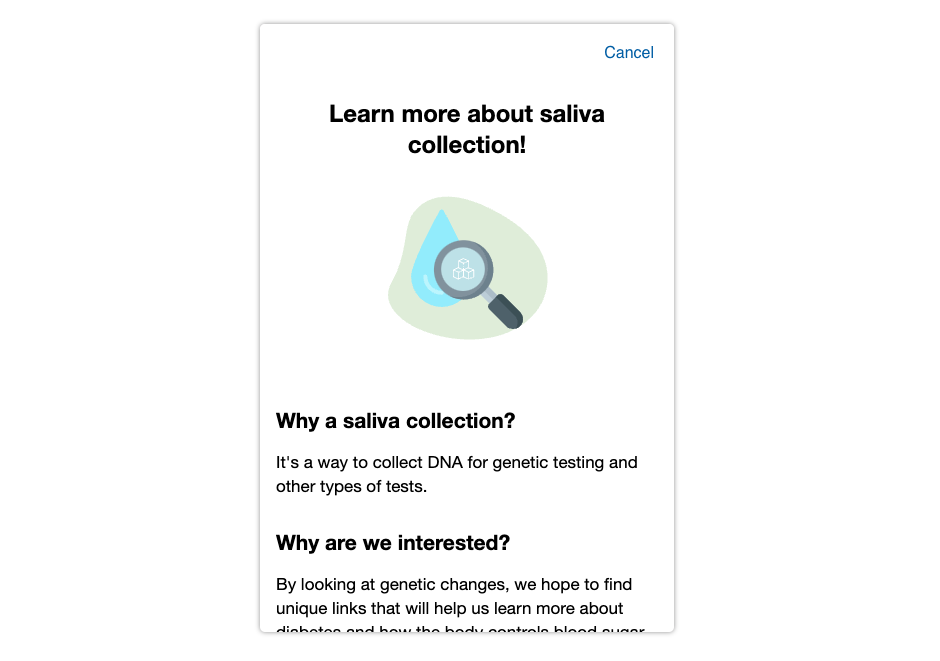
- Informational Steps: Use illustrations to visually represent key concepts or instructions. This can make complex ideas easier to understand.
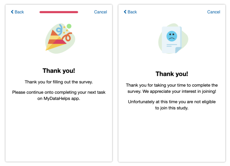
- End of Survey Step: Graphics can add a friendly touch to the closing steps, such as a "thank you" or a message indicating that a participant doesn't meet the study's qualifications.
These visual elements, combined with best practices for reducing participant cognitive burden, such as using white space, strategic paragraphing, and bolding important text, can create a more engaging and accessible survey. By implementing these visual aids, you can keep participants interested and ensure that the information in your survey is easily digestible.