The App Designer is where you create and manage your participant app experience. This allows you to control the arrangement of content displayed to participants, tailoring it to fit your project's needs. Create survey task lists & call-to-action cards, return device data & health records, provide resources, and much more.

Overview
Getting Started
You can access the App Designer by navigating to the App Designer tab within your project. Once here, you'll have a few different sections:
- Preview: On the left is a preview of your Tab and Secondary Views for you to review. You can hover over a Tab or Second View for it to show here.
- Look & Feel: This section allows you to control the look and feel of the app layout, including the option to add full width logos.

- Tab Views: This section is where you will create and manage your Tab Views, which are the views accessible to participants across the bottom of the MyDataHelps app.

- Secondary Views: This section is where you will create and manage your Secondary Views, which are the views that can be launched by the Action or Button components in your Tab Views.

Building Your Views
When adding a Tab or Secondary View, you'll click the New Tab View + or New Secondary View + button. You'll then have a choice of templates to choose from, including a blank view:

Once you've selected your template and clicked Use This Template, you'll need to provide your tab details, which differ for a Tab View and a Secondary View.
Tab View Details include Title, Image, Badge Source, Visible to Segment, Unique Key, & Platforms:

Secondary View Details include Unique Key:

After providing your tab details and clicking Save and Customize, you'll be brought to the View Builder, which is a drag-and-drop tool to configure your view. 
Components are the building blocks of your view. All of the various components are on the left-hand side of the View Builder and can be dragged and dropped into your view. Placing a component to the left of another component will place it above; to the right, below. A horizontal line will display when you are able to place a component inside another, such as in a section component.
Refer to the View Builder: Components article for a complete list of components as well as examples of them.
Layers
The Layers section is in the bottom right and can be used to navigate through your view. Clicking on a layer will bring you to that component’s or view’s settings.
Component & View Settings
Once you’ve dragged and dropped your component into your view, you’ll likely want to configure its settings. You can either click on the component within the view to bring up the component’s settings in the top right or use the Layers section in the bottom right to select your component. Each component has its own unique settings.
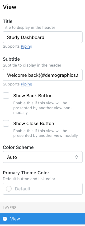
In addition to component settings, your view also has settings. You can click on your view outside a component (e.g., at the very top) or use the Layers section to bring it up.
Language
In addition to your project’s default language (English), you can select other languages from the Language drop-down in the top right of the View Builder.
Preview Modes
You can click the Sun/Moon icon in the top-right to toggle light and dark mode for your view to see how it will look for participants in both modes. You can also click the phone/computer icon in the top-right to toggle between mobile and desktop views.
Import & Export
If you have views you've built in other workspaces or projects, you can click Export on those views from the View Builder and then Import the file in the project where you'd like it.
Advanced Logic
Advanced logic allows you to make your view more dynamic, responding to the participant or other data. For example, you might want to display a participant field, use an expression in your view, or show step goals on a graph.
Refer to the View Builder: Advanced Logic article for more information on how to make your views more dynamic.
Saving & Editing
As you’re working on your view, you may wish to Save or Save & Exit from the view in the bottom right. Doing this will save your view. You can click the pencil icon by your view at any time to go back and edit the view, the gear icon to edit your view details, or the trash icon to remove the view.
View Builder Examples
Refer to the View Builder: Examples article for some great use cases and view builder scenarios.