
You can customize many aspects of a survey's font and color scheme using the "Styles" tabs within survey designer. Configurable elements include:
- Color schemes (light & dark mode)
- Progress Indicator
- Title and body fonts
- "Next" button
- Icons
- Content Items
- Markdown format
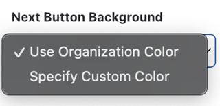
Some color options support the use of the Organization Color set in Workspace Settings to simplify color selection.
Survey Style
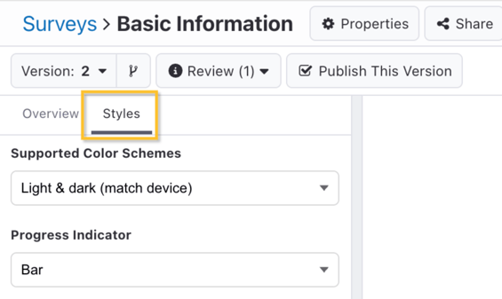
In the left pane of the survey editor is the survey-level "Styles" tab. These settings apply to the entire survey.
In the below example, some settings have been customized from their defaults in a survey which includes both light and dark color schemes. What follows is an example step in each color scheme to illustrate how they differ.
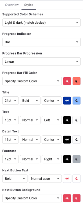
| Light Mode | Dark Mode |
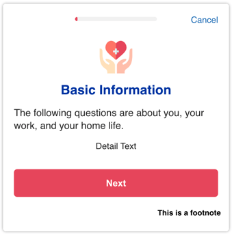 |
|
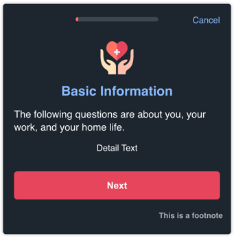
Color Schemes
Standard Surveys can support both light and dark color schemes, and can match the settings of the user's device for a more consistent and appealing user experience.
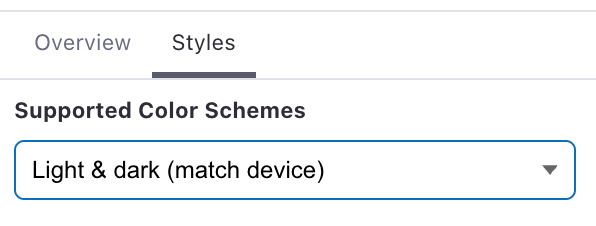
If only one color scheme is selected, e.g., "Light mode" or "Dark mode" only:
-
Only one color choice will be presented for the various survey style options.
- The survey editor, Try It Out mode, and will reflect the chosen color scheme.
If "Light & dark (match device)" is selected:
- Two color options will be presented for the various survey style options, unless "Organization Color" is available and selected.
- The survey editor, Try It Out Mode, and preview download can be changed to either mode.
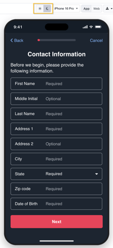
Progress Indicator
You can optionally display an indicator of participant's progress at the top of each step. Available options for the progress indicator include:- Auto: Defaults to "Text", but will hide the indicator if there are navigation rules.
- None: Hides the progress indicator.
- Text: Will display the step number out of the total survey steps (e.g., "Step 1 of 4").
- Bar (default): Will display a progress bar with your choice of progression (linear or fast to slow) and color.
Individual steps, such as branching or completion steps, can be excluded from counting as part of the progress indicator.
Text
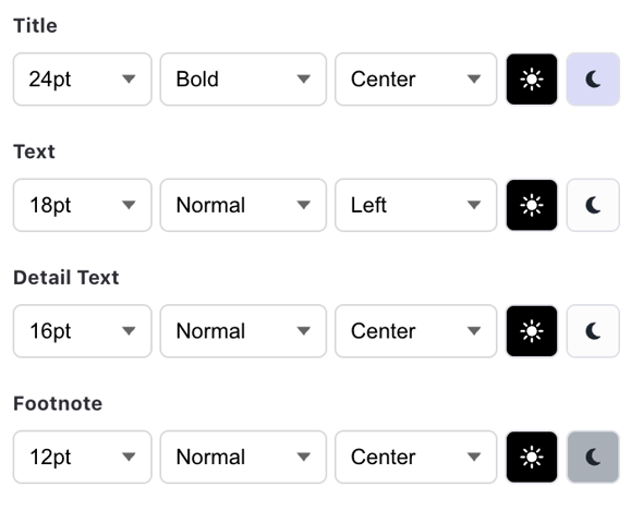
The size, weight, placement, and color of text found in the following parts of survey steps are also configurable:
- Title
- Text
- Detail Text
- Footnote
 "Next" Button
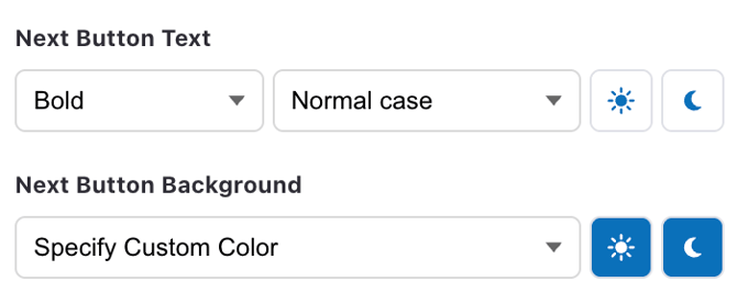
For steps with a "Next" button, you can specify the text weight, casing, and color as well as the button background color.
Icon Image
The size and placement of Icon Images is also configurable. Icon images appear at the top of instruction, form, and question steps.
Content Item Icon
If you are using content items within instruction steps, you can control the default look and feel of the icons.
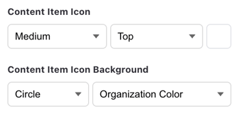
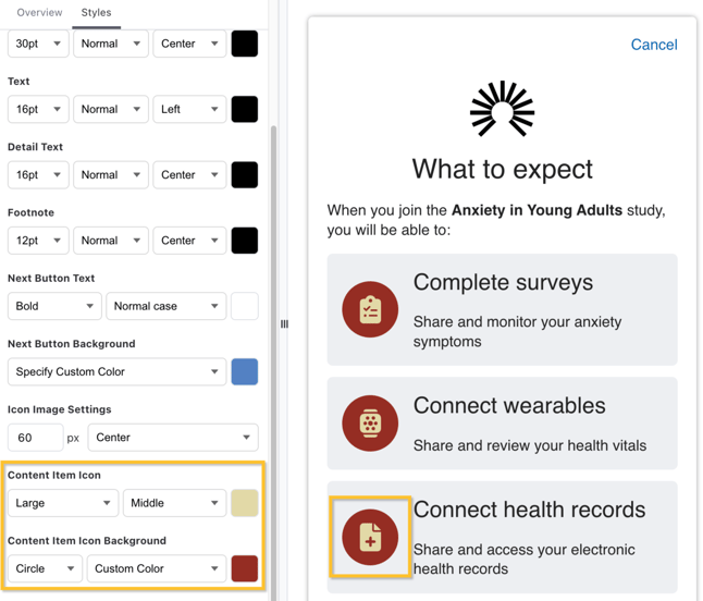
The Content Item Icon allows you to control the icon's color (using a color picker), size (medium or large), and positioning (top or middle). The Content Item Icon Background allows you to control the icon's background shape (none or circle) and color (organization/workspace color or select from the color picker). For example, if you wanted large, light yellow icons on a red background in the middle of your content item in light mode, you could do:
Markdown Format
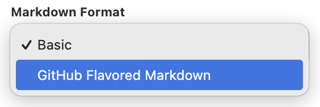
You can also select whether to use basic or GitHub Flavored Markdown for more advanced text formatting capabilities. By default, new surveys will use GitHub Flavored Markdown. This allows for simple insertion of visual elements like tables and lists. Read more in Formatting Survey Text.
Step Style Override
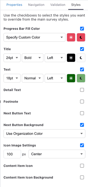
Each step can also have a unique override of the survey style too. In the right sidebar, click on the "Styles" tab to see of the full set of options. You can override any combination of style options for each step, and if you have both light & dark schemes can change colors for each separately.
For even further control over the appearance of a specific survey step, you can use a Web View Step and design your step using HTML.